DIGITAL · UI/UX — PROJECT 02
Clima
A weather application designed around how people actually need weather — by location, by condition, by mood
UI/UX design · PM Accelerator · 2026
ROLE
AI UI/UX Designer
TYPE
UI/UX design exploration
SCREENS
20+ designed screens
TOOLS
Figma · iOS 15 UI Kit · Illustrator
THE BRIEF
REQUIRED FEATURES
KEY DESIGN DECISION — COLOUR AS LANGUAGE
USERS
SCREENS
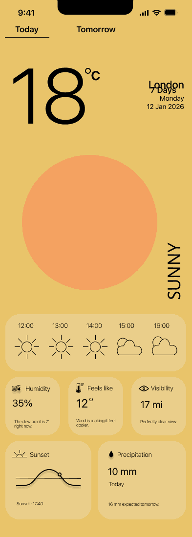
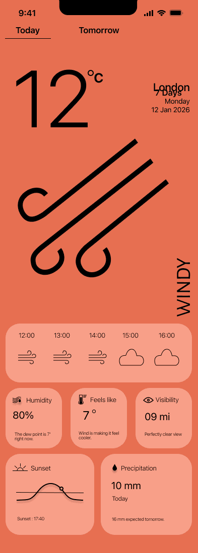
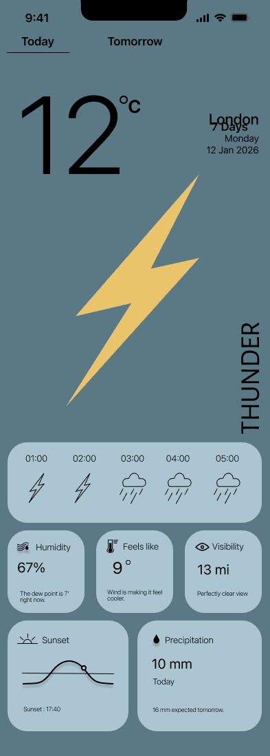
The single most important decision in the whole project: each weather condition gets its own full-screen colour palette. Not just an icon — the entire app changes mood. Sunny is warm yellow. Rainy is deep teal. Thunder is near-black navy. Snowy is cold grey. Windy is terracotta orange. This makes the weather legible at a glance before you read a single number.
PROTOTYPE
Most weather apps suffer from information overload — they give you everything and help you with nothing. The aim of Clima was different: a weather application that allows users to easily access accurate and personalised weather information for multiple locations, with a 5-day forecast, without cognitive overload.
Each screen addresses a specific user need identified in the research phase. The progression moves from the core experience through to supporting features.
The full prototype — flowing through current conditions, 7-day forecast, multi-location switching, weather warnings, and preferences.
Business person · commuter · international traveller
Needs to compare weather across cities quickly, know current conditions and near-future forecast, reduce cognitive load while travelling, and switch locations fast.
PRIMARY USER
Multi-location overview must be front and centre. Current conditions and 5-day forecast immediately visible. No clutter, no deep navigation
Frequent traveller · multi-location
DESIGN IMPLICATION
Outdoor enthusiasts · farmers · event planners
SECONDARY USER
Long-term planner · 1–6 months
Needs trends over time rather than daily details, macro patterns — hotter, wetter, colder — and confidence for future decisions, not granular hourly data.
Long-term view should exist but not overpower the main experience. Likely accessed via a secondary tab or toggle
DESIGN IMPLICATION



The core design challenge: weather data is the same everywhere. The difference is entirely in how you present it.
Add / remove / reorder locations. Clear visual identity per location. Dashboard with location cards and drag-and-drop edit mode.
Multiple location tracking
Temperature, precipitation, wind, humidity. Clear visual hierarchy. Easy day switching. Tap any day to expand detail.
5-day forecast
Current conditions
Large prominent temperature. Weather icon. Supporting metrics — wind, humidity, rain. The hero section of the app — no hunting for key info.
User preferences
Celsius / Fahrenheit. Notifications. Dark mode and light mode. Colour themes per weather condition. Clean settings — don't skip it.
SUNNY
#EACE8A
WINDY
#E76F51
THUNDER
#5A7985
WINDY
#48595F
CLOUDY
#264653
RAINY
#2A9D8F
Recorded from Figma prototype · 2026
01 — Current conditions

The hero screen
Large temperature display, location name, and date at a glance. A full-bleed weather illustration communicates the condition before the user reads a number. Hourly timeline and supporting metrics — humidity, feels like, visibility — sit below the fold for those who want more.
03 — MULTI-LOCATION TRACKING

Multicity
A world map view pinning all saved locations, with a scrollable list below showing each city's current temperature and condition at a glance. Search to add a new city — typeahead suggestions appear immediately. Built for the primary user who needs to compare cities before a trip without opening each one individually.
05 — PREFERENCES

Clean, don't skip it
Units (Celsius / Fahrenheit), notifications, appearance (light / dark / colour themes), and report an issue. Three levels of hierarchy via a cascading menu — tap a category to reveal its options. Designed to be a clean, simple settings screen that doesn't need to be beautiful, just reliable.
02 — 7-DAY FORECAST

Progressive disclosure
Compact list view of the week ahead — temperature and icon only by default. Tap any day to expand the detail row: wind, humidity, precipitation. A quick glance gives you the week shape, while a tap gives you the data to make a decision.
04 — WEATHER WARNINGS

Alert state
A distinct alert overlay appears when severe weather is forecast — full descriptive text, not just an icon. The background dims and the warning takes over the screen. Designed to be impossible to miss while remaining readable and calm — no alarming red, just a clear hierarchy that says "read this."