Every tracked object (home, car, purse, glasses, keys) has a custom icon in a consistent warm amber — making the home screen scannable at a glance without reading any text.
02 — HOME SCREEN
My Keys — everything at a glance
The home screen lists every registered keychain with its name, current status (Live · First Street), and two actions: Buzz and Location. A + button in the top right adds a new keychain. The list is scannable in under two seconds — no dashboard, no map on the default view, no cognitive load.

04 — LOCATION
Out-of-range finding
DIGITAL · UI/UX — PROJECT 04
Finders Keepers
A Find My iPhone-style item tracking app — locate your keys, glasses, car, and bag from a single screen
UI/UX design · 2025
ROLE
AI UI/UX Designer
TYPE
UI/UX design exploration
SCREENS
30+ designed screens
TOOLS
Figma · iOS 16 UI Kit · Illustrator
THE BRIEF
THE DESIGN LANGUAGE
KEY SCREENS
We've all lost something small — keys, glasses, a bag — and spent 20 minutes retracing steps before finding it exactly where it shouldn't be. Finders Keepers is a tracker app designed to solve that: attach a small keychain device to any object and locate it instantly from your phone.
Each screen was designed and connected in the prototype — the full flow is interactive across all three scenarios.
The visual identity is warm and approachable — a bear mascot called FinderSeeker, golden-brown iconography, and a clean white iOS-native layout. The warmth is intentional: losing something is stressful, and the app's job is to immediately reduce that stress, not add to it with a cold or technical interface.
The design challenge was making a complex tracking system — Bluetooth range detection, map-based location, buzzing alerts — feel as simple as a list of your things. One screen. One tap. Found.


USER FLOW SCENARIOS
01 — ONBOARDING
The entry point
The splash screen — a white background, the FinderSeeker bear mascot, and the app name — loads before handing off to login or sign-up. The sign-up flow collects name, email, and password across a multi-step keyboard flow, with email verification before the user reaches the home screen.
Three distinct scenarios were designed and fully prototyped — each one testing a different aspect of the app's core experience.
03 — BUZZ
In-range finding
Tapping Buzz on a keychain that's in range opens a full-screen view showing the item's icon centred on screen. Concentric rings expand outward from the icon — a visual pulse that mirrors the audio pulse the physical keychain is emitting. A Stop button ends the buzz. The animation was designed to feel calm and methodical rather than urgent.
05 — NEW KEYCHAIN
Adding a tracked object
The new keychain setup screen lets users name their item and pick an icon from a library of six options — home, car, keys, glasses, purse, and a pipe (for miscellaneous objects). Name field, icon grid, and a Next button. The success state shows a confirmation modal before returning to the updated home screen.
PROTOTYPE
The full prototype covers all three scenarios end-to-end — registration, adding a keychain, and locating a lost item both in range and out of range.
WHAT I'D DO DIFFERENTLY
This was a design exploration — no hardware integration, no real Bluetooth API. The flows work as a prototype but the real challenge of this product is the physical keychain itself: its size, battery life, and attachment mechanism would shape the app's design significantly. A smaller keychain changes what information matters on the home screen; a longer battery life changes how the out-of-range state needs to communicate urgency.
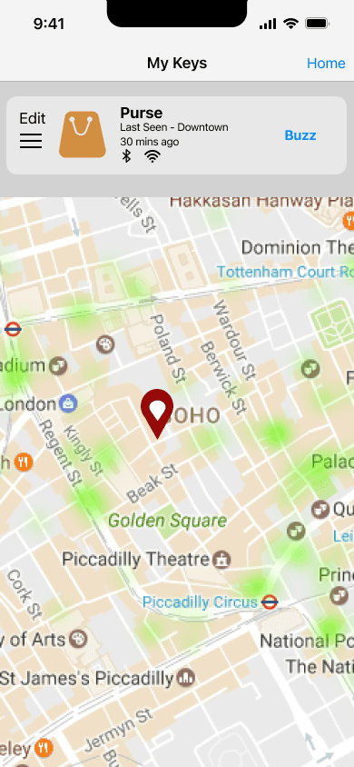
I'd also redesign the map screen. The current version uses a standard map tile with a single pin — functional, but it doesn't carry the warm visual identity of the rest of the app. A custom map style matching the golden-brown palette would make the out-of-range experience feel consistent with the rest of the product rather than like a hand-off to Google Maps.
Scenario 1 — first-time registration
A new user opens the app for the first time, has no account, and registers using their email. The flow moves from splash screen through login, sign-up form with keyboard states, email verification, and lands on an empty home screen prompting them to create their first keychain. Designed to feel frictionless — the fewest possible steps from download to first use.
Scenario 2 — adding a new keychain
An existing user with three keychains (Home, Car, Purse) gets a new phone and reinstalls the app. After logging back in, they want to add a fourth keychain for their Glasses. The flow shows: log in, view existing keychains, tap the + button, name the new keychain, select an icon from the library, receive a success confirmation, and return to the updated home screen with all four keychains listed.
Scenario 3 — locating a lost item
A logged-in user in their car can't find their glasses or purse. The glasses are in Bluetooth range — tapping Buzz makes the keychain emit a sound, with the app showing an animated ripple expanding outward from the icon. The purse is out of range — tapping Location shows its last known position on a map: Downtown, 30 minutes ago. The user drives Downtown, taps Update, the purse comes into range, and buzzing finds it. This scenario tests both the in-range and out-of-range states of the core feature.
FinderSeeker — a round bear face with a magnifying glass — appears on the splash screen and becomes the app's emotional anchor. It signals immediately that this is a friendly, personal tool, not a surveillance product.
Bear mascot
Golden-brown icon system
When a keychain is out of Bluetooth range, tapping Location shows a map with a pin at the last known location and a timestamp — "Last Seen · Downtown · 30 mins ago." An Update button refreshes the location when the user gets closer. This screen uses a real map tile (Google Maps integration in the prototype) so the location feels immediately legible.